
Fire & Ice: Darkwolf #1 - A Moody Beginning
Darkwolf looks brawny and grim enough to give Conan are run for his money, but will be be able to go toe-to-toe with him in the long run?

Fire & Ice: Darkwolf #1 (Dynamite – 2026)
Writer: Dan Panosian
Artist: Andrey Lunatik
I didn’t really know what to expect from this, whether it would be a blatant rip-off and money-grab, or whether the mag would establish itself as a legitimate sword & sorcery comic. I have to say that at this early stage, I liked it well enough, but it didn’t blow me away (yet).
I can’t really say much about the story yet as it is still early days, but it serves as a solid launching pad for interesting future developments.
Evocative and moody
I’m a big fan of Dan Panosian’s artwork, but I had no idea if he could write or not. He wouldn’t be the first comics artist to think he could do it all. So, I was pleasantly surprised by quality of the writing, which is evocative and moody, verging on the poetic. It was, however, a bit of quick and flimsy read and I went through it like a hot knife through butter. Perhaps it’s unfair to expect much more from an introductory issue, but I hope we get a bit more (red, raw) meat in the coming issues.
Flesh and iron
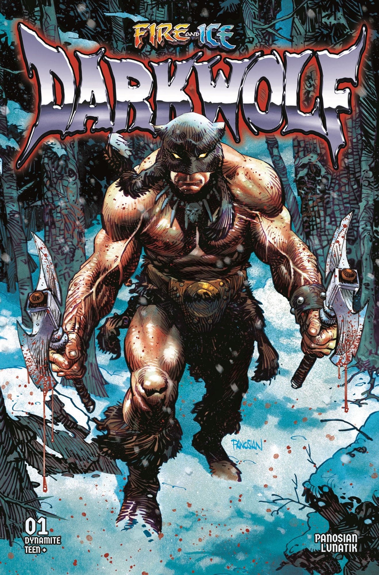
Dan Panosian’s imposing cover is featured here and I think it’s a beauty. I actually got the regular cover by Stjepan Sejic, who I usually like a lot, but this one seems a bit too artificial with his skin tones looking more like plastic than real flesh. The dragon is neat though. I hope Sejic isn’t going the way of Alex Roth with his perfect rendition of plastic action figures instead of real people of flesh and iron. I’ve also noticed this tendency on his recent spate of Batwoman covers, so I’m becoming a bit leery of his work. If you do get to choose, I would go with the Panosian cover.
An imposing figure
It’s not surprising that a book inspired by master visualist Frank Frazetta mainly focuses on the visual elements, more than an actual story. As you would imagine, Darkwolf himself is certainly an imposing and impressive figure, and you get the idea he could go toe-to-toe with Conan himself. The artwork in general is strong, especially the atmospheric colouring. I loved the swirling snow and the muted greys and washes.
A horse of a different colour
This Lunatik guy shows a lot of promise and his figures and faces are rendered well, but he really needs to work on his horses, which I thought were so bad that they detracted from the overall quality of the artwork. Horses – like all animals – are notoriously hard to draw for sure, but if you are going to do sword & sorcery a good command of equine physiognomy is an arrow you need in your quiver. Perhaps he should’ve camouflaged his ineptitude by just drawing the mounts as some kind of sorcerous hybrid, which would’ve preserved the fantasy spell instead of disrupting the illusion at times. It’s not an insurmountable obstacle as BWS himself wasn’t great at horses either - but BIG Jawn Buscema was.
By Mitra!
To my surprise, I noted the ‘Mitra’ was mentioned towards the end of the book. Isn’t Mitra a Howard variant of ‘Mithra’ and therefore part of Conan lore, or have I got things arse backwards?
In short, this was a good start, which I think can go two ways, it can evolve into an more thoroughly fleshed out sword & sorcery tale, or it can continue to let the visuals do the heavy lifting and focus on s&s tropes, remaining largely derivative and redundant, but still nice to have for a four issue run. I would really like to see a new, long-standing sword & sorcery character emerge, and Darkwolf has all the ingredients, it just depends whether he remains half-baked or not.